CLIENT: Rachel Storey Law (2023)
SCOPE: Campaign, Strategy
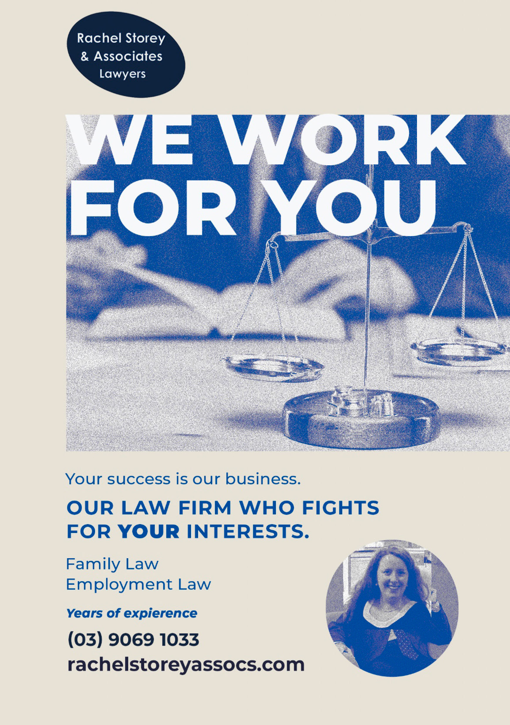
I designed an advertisement for a law company that balances friendliness, professionalism, and minimalism with a grain texture requires a thoughtful approach.
A clean, structured layout with ample white space ensures clarity and sophistication, while a muted, neutral colour palette—such as warm greys, soft blues, or deep greens—can create a welcoming yet authoritative feel.
A subtle grain texture adds depth and warmth, softening the overall design and making it feel more approachable. Simple, modern typography, such as a refined sans-serif or a contemporary serif, enhances readability while reinforcing professionalism.
The use of a single, well-placed graphic element—such as an abstract symbol, a balanced scale, or a confident handshake—helps convey trust and reliability. This approach creates an inviting yet polished visual identity that positions the law company as both client-focused and highly professional.