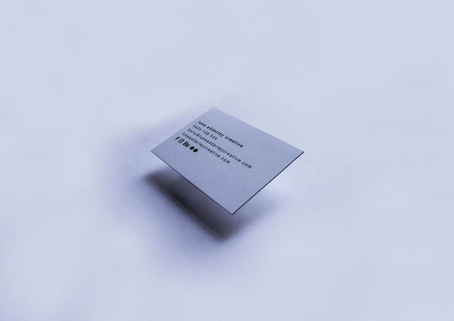
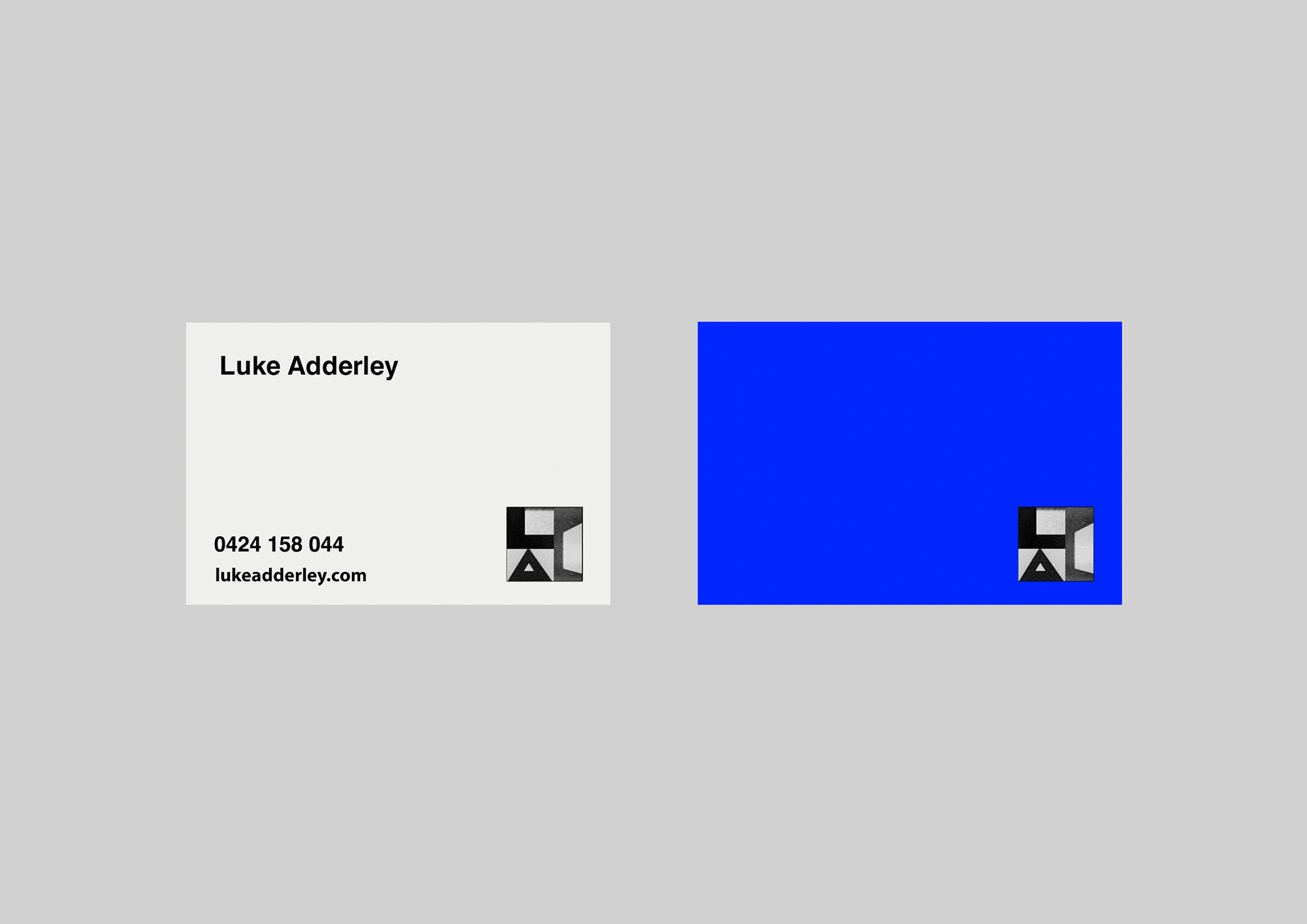
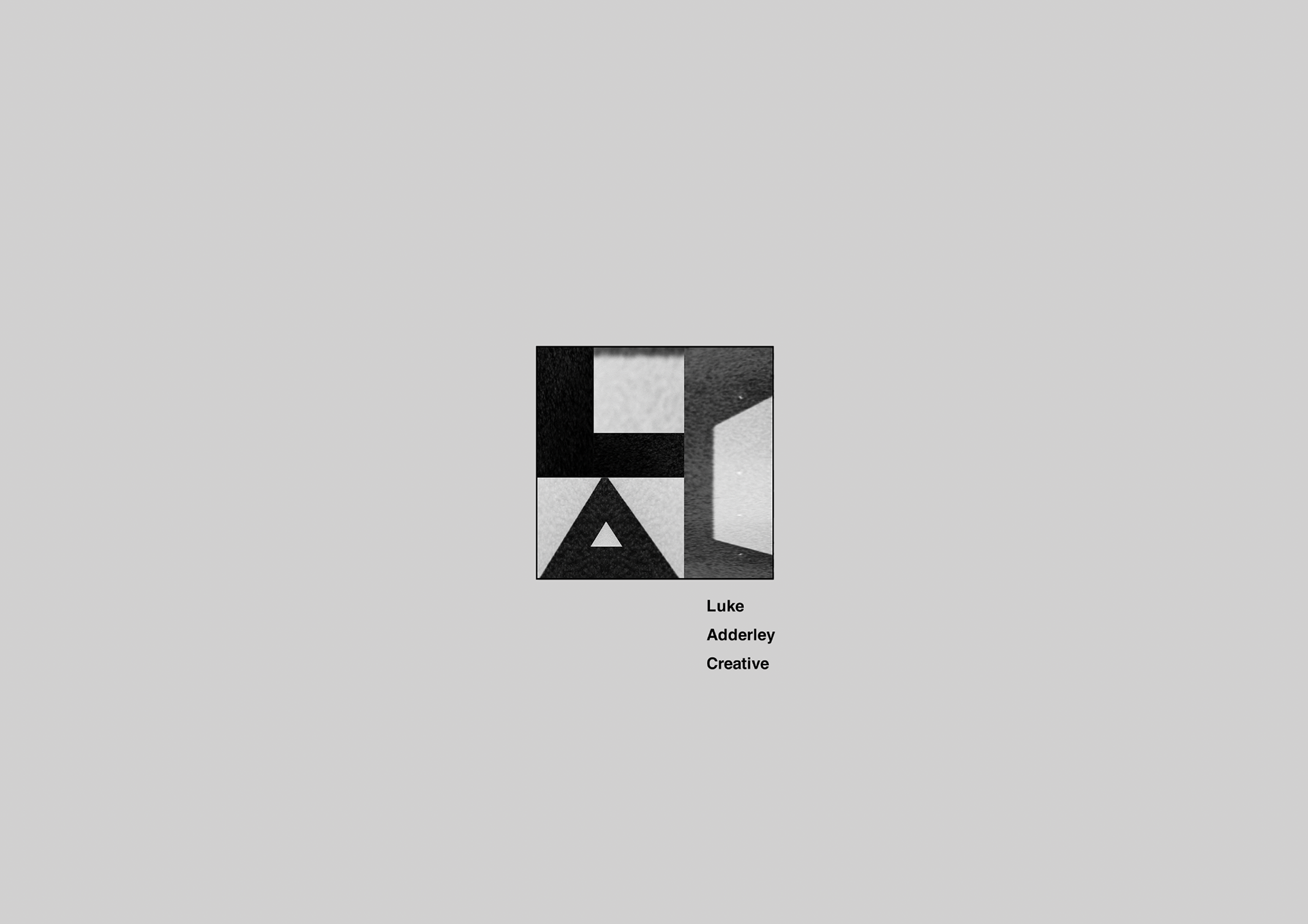
CLIENT: Luke Adderley Creative
SCOPE: Identity
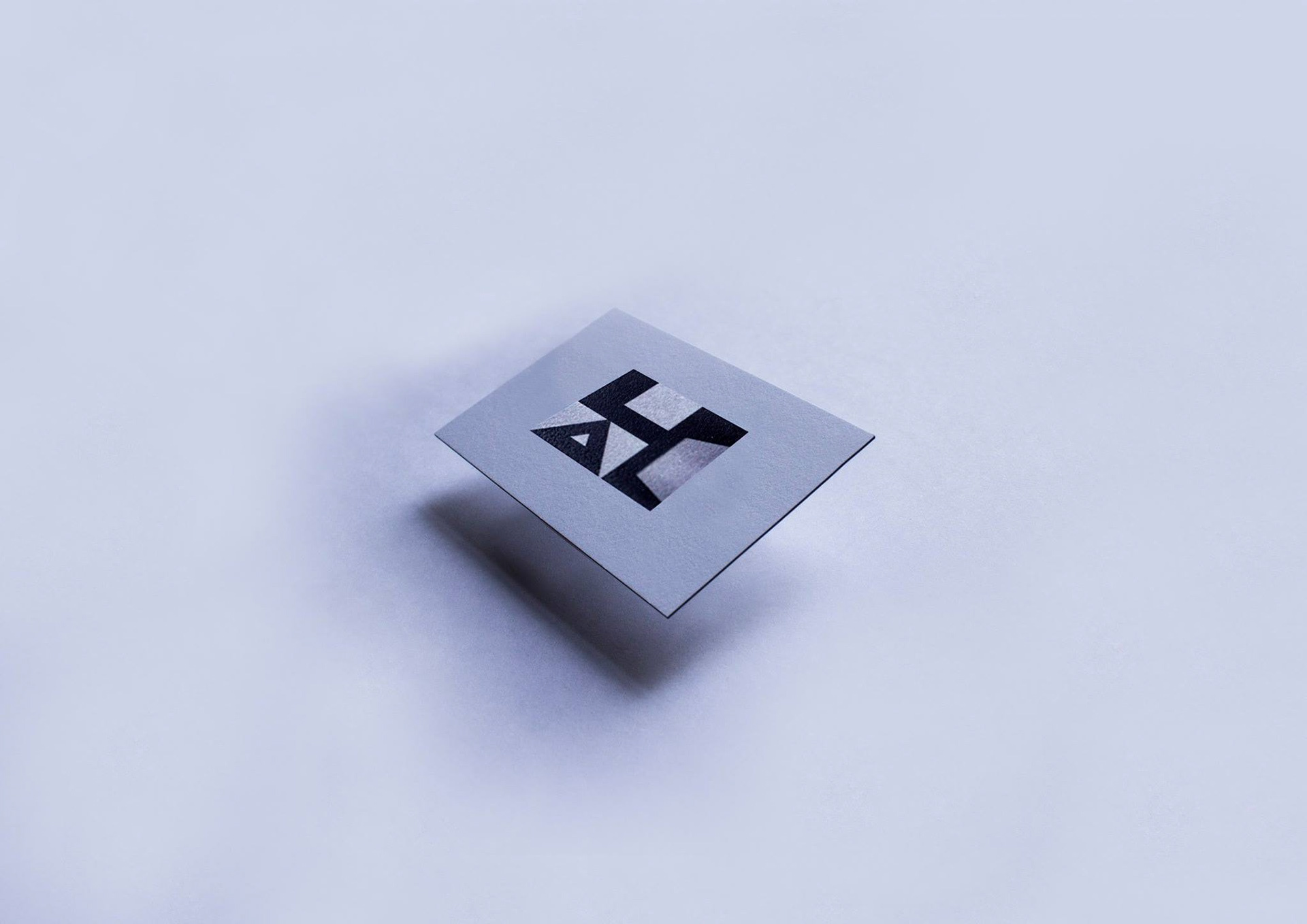
I created a logo for an alternative, modern, and progressive design company requires a bold yet refined approach that breaks conventions while maintaining clarity and impact.
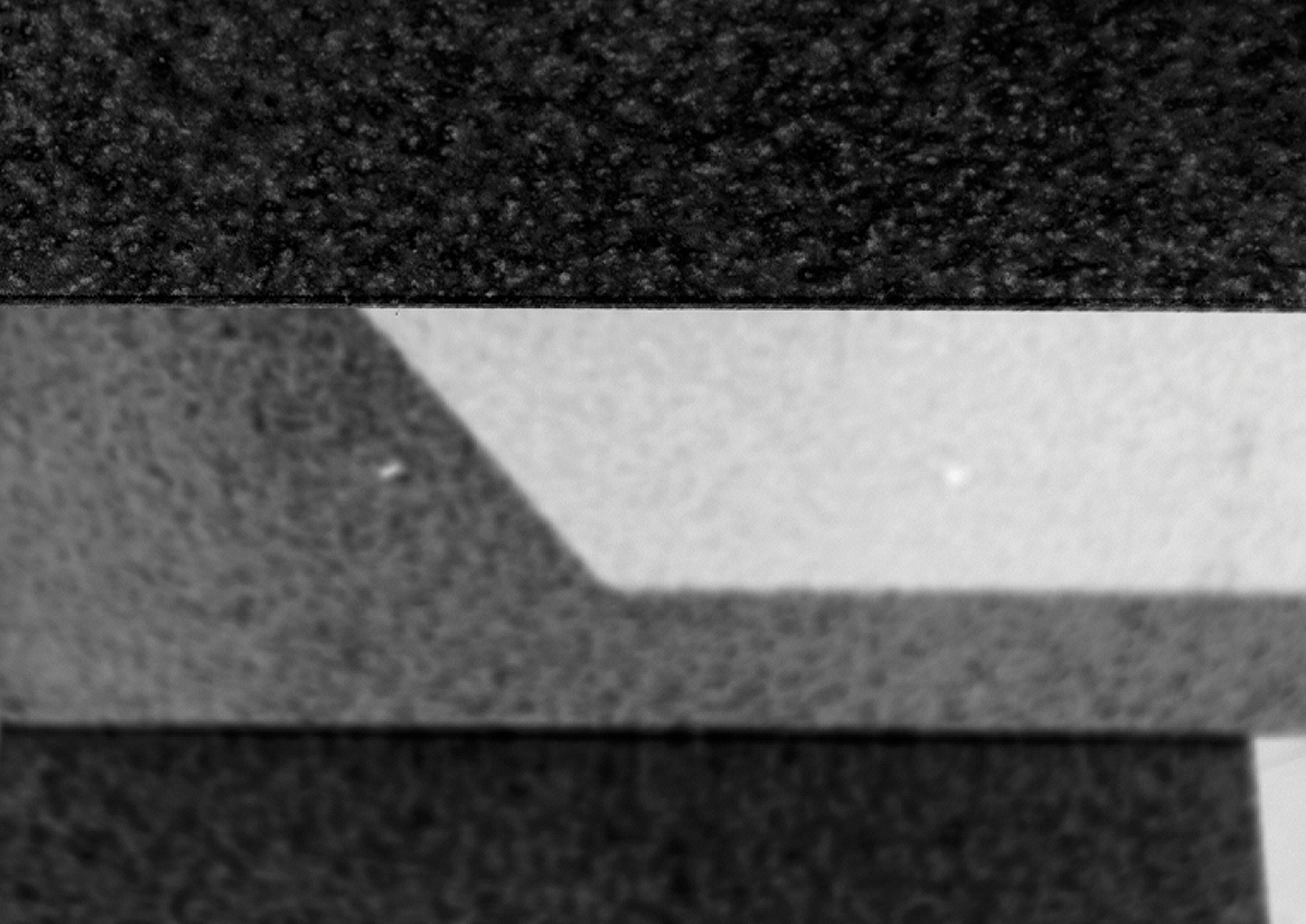
The design embraces unconventional typography perhaps a custom, slightly distorted, or geometric typeface—to reflect innovation and originality.
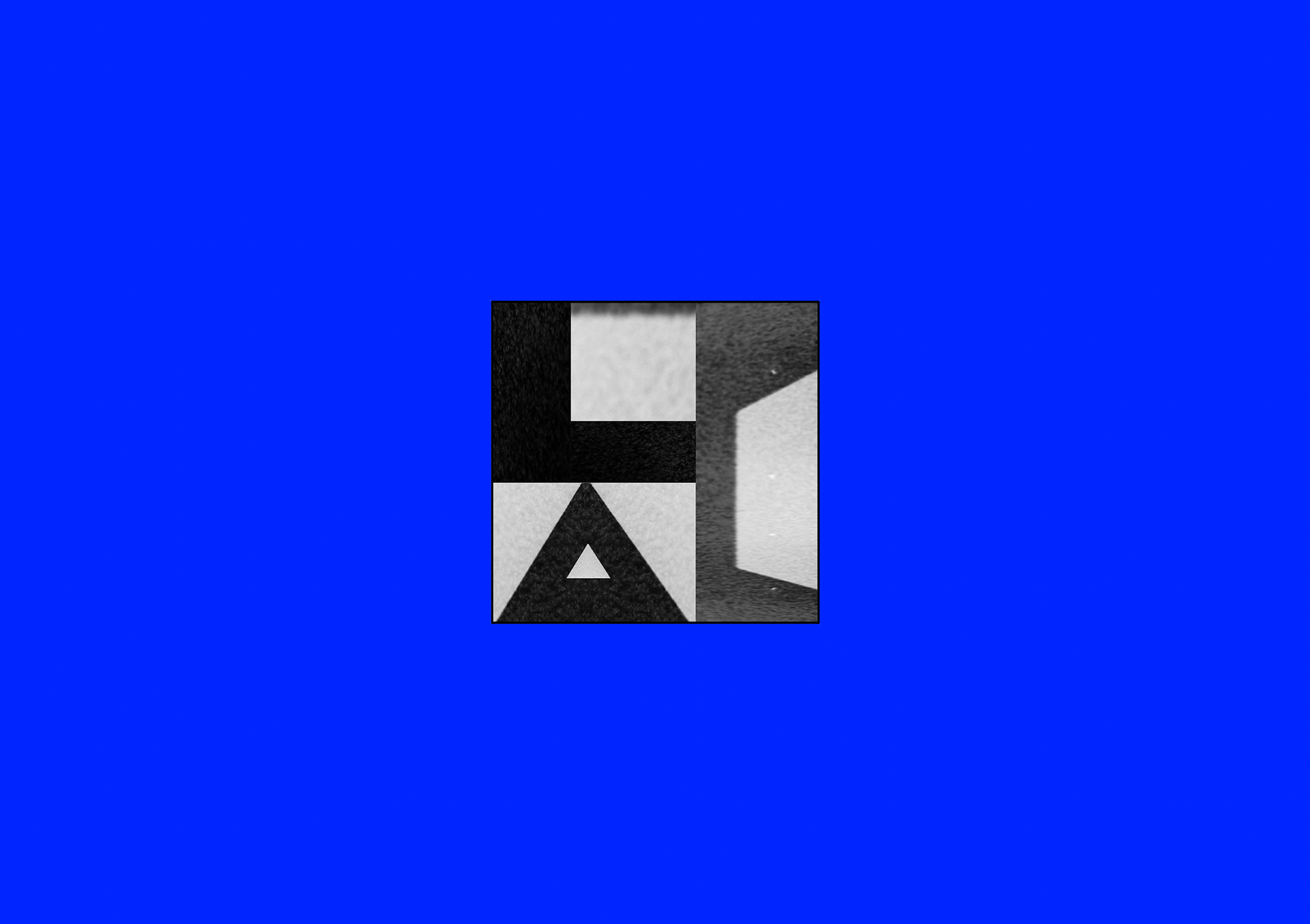
A minimalist yet edgy symbol, such as an abstract shape, deconstructed letterform, or dynamic motion-inspired element, can reinforce the company’s forward-thinking ethos.
A sleek, contrasting colour palette—like monochromatic tones with a pop of electric blue adds vibrancy while keeping the aesthetic sophisticated. Subtle gradients, asymmetry, or layered transparency can further push the modern, experimental feel.
The goal was to craft a logo that instantly communicates creativity, adaptability, and a fresh perspective, making a strong statement in the world of progressive design.