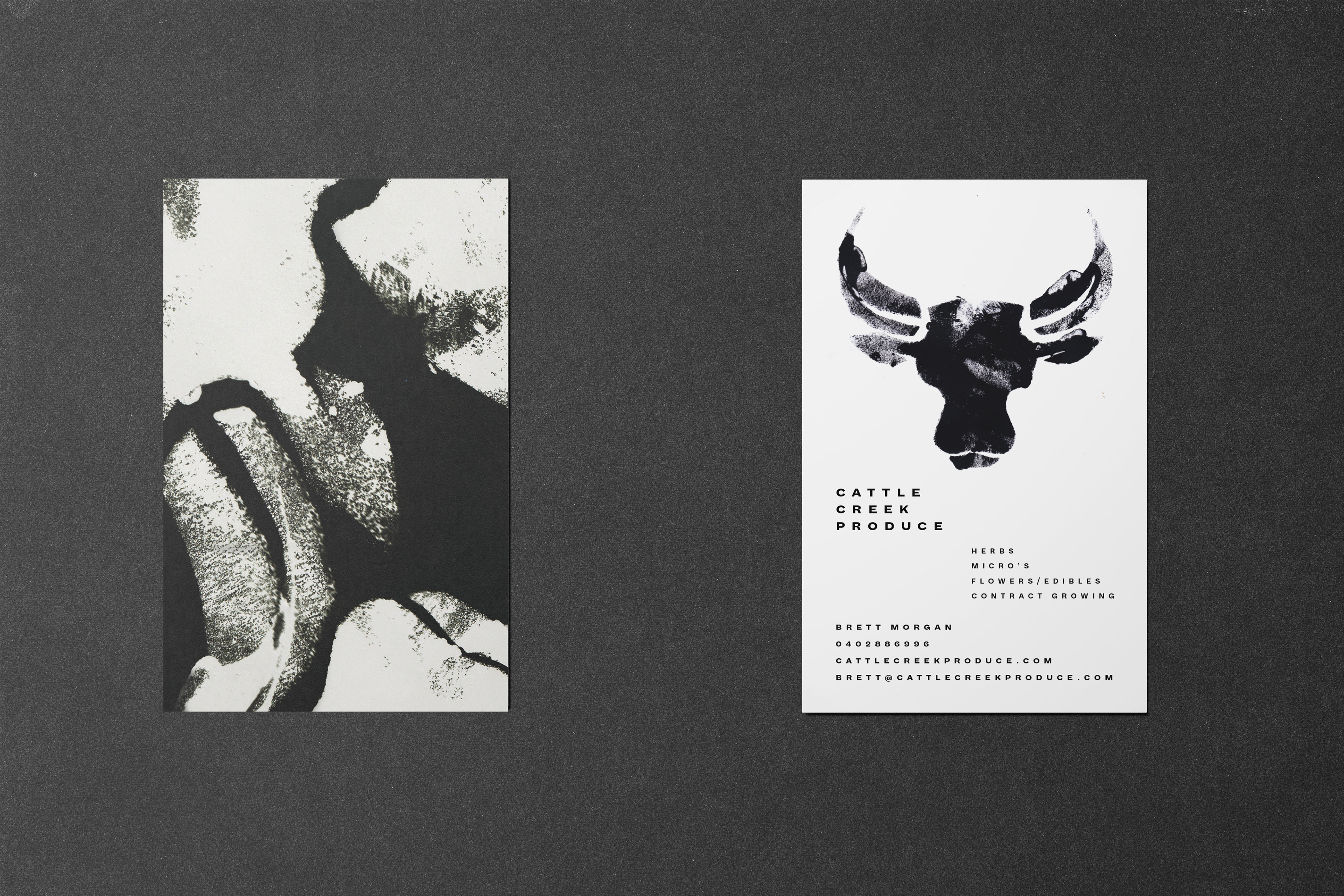
CLIENT: Cattle Creek Produce (2018)
SCOPE: Identity, Business Card
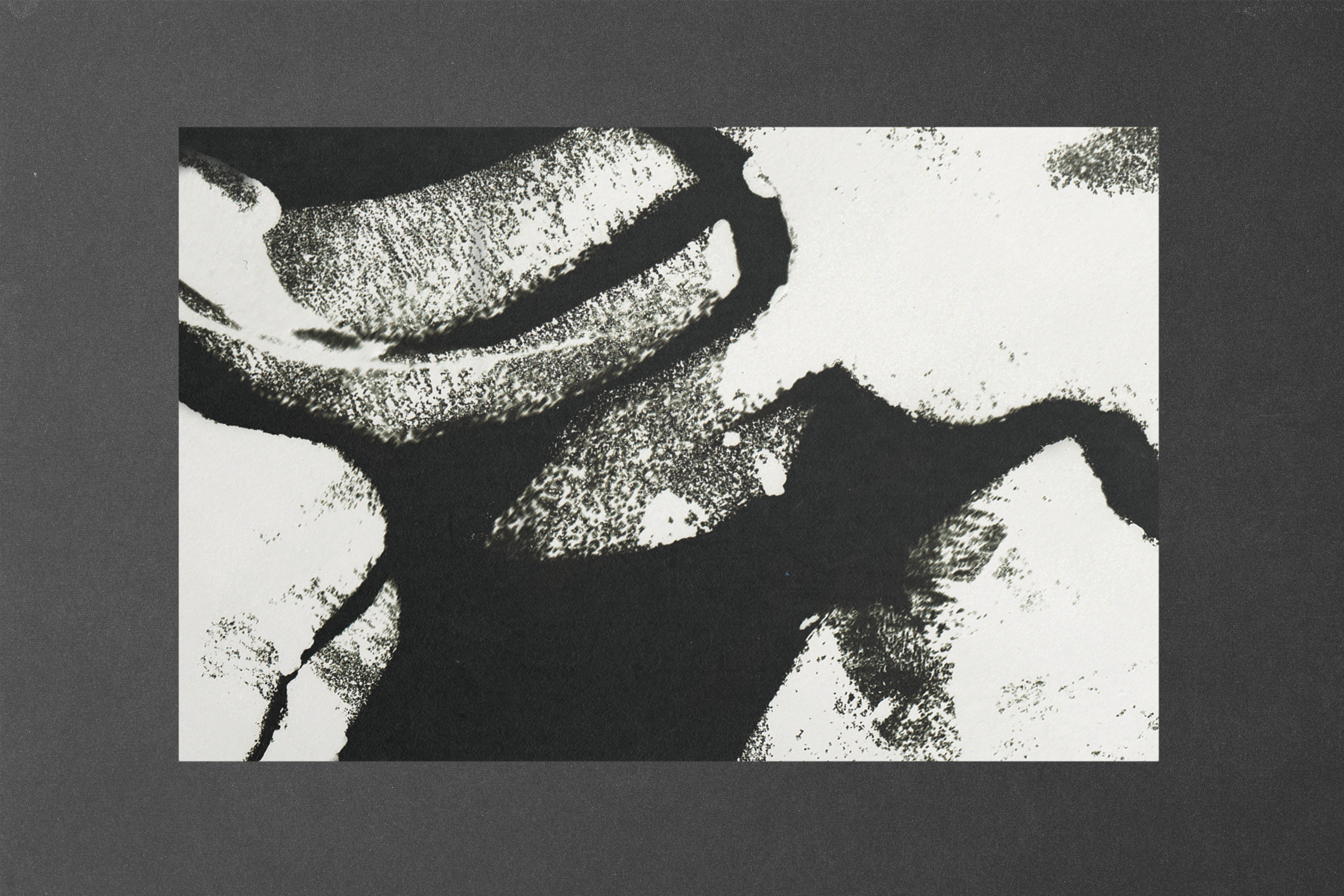
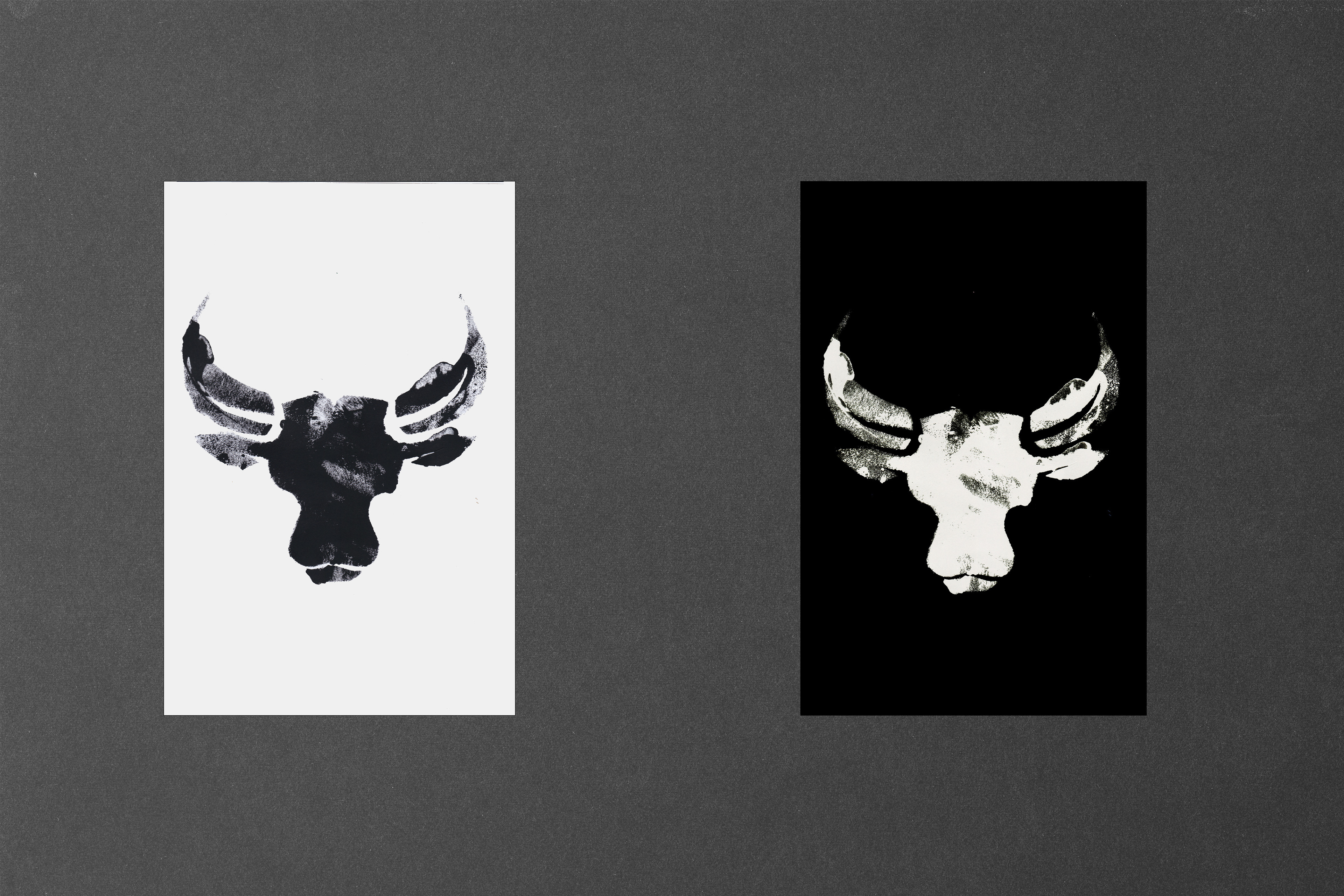
I created a gritty, rough brand identity for an organic produce business embracing the raw, authentic essence of nature while conveying a sense of sustainability and hard work.
The logo features distressed textures, hand-drawn illustrations and rugged typography to evoke a sense of earthy, unpolished charm. A colour palette of black and white captures the organic, farm-to-table spirit, while rough edges or uneven lines give the design a handmade, no-frills feel. Imagery like weathered farm tools, soil, or imperfect produce can further emphasise the authenticity and honesty of the business.
The overall design communicates a return to simplicity and a focus on real, unrefined products, appealing to customers who value natural, sustainable farming over mass-produced alternatives.
This gritty identity will help position the business as a grounded, trustworthy provider of organic goods with a story rooted in hard work and environmental responsibility.