CLIENT: Ashwin & Clark (2025)
SCOPE: Identity, Signage, Campaign, Strategy
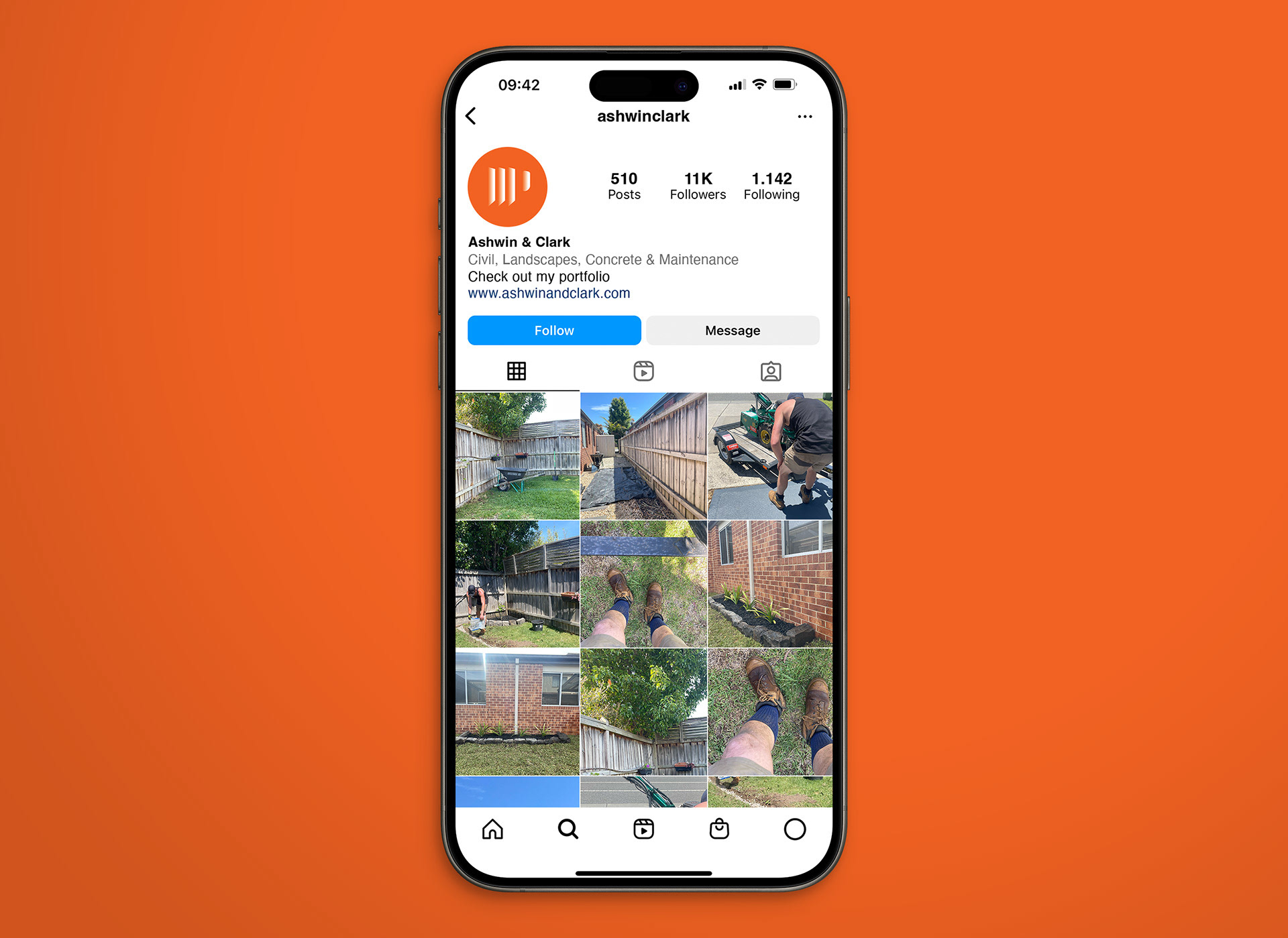
Creating a polished yet gritty brand identity for a landscaping business involves blending rugged, earthy elements with a professional edge.
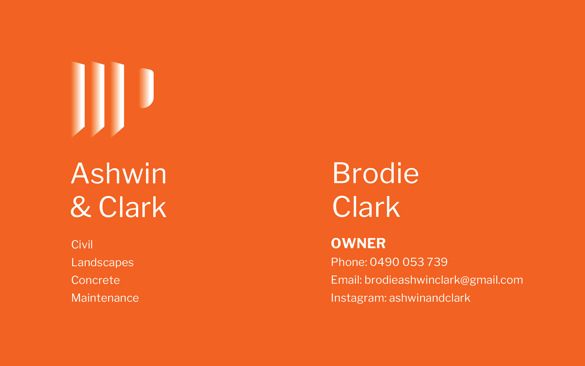
The logo should evoke strength and durability, using bold, angular lines paired with organic shapes to symbolise the raw beauty of nature.
Typography is strong and straightforward, perhaps with distressed or industrial touches, giving the brand an authentic, no-nonsense feel.
The overall design reflects a hardworking, bold approach, while maintaining a level of sophistication that appeals to both residential and commercial clients.
This gritty brand identity will resonate with customers looking for a landscaping service that’s as tough as it is professional.