CLIENT: Dinner Thyme (2016)
SCOPE: Identity, Guidelines, Signage, Campaign, Strategy, Packaging
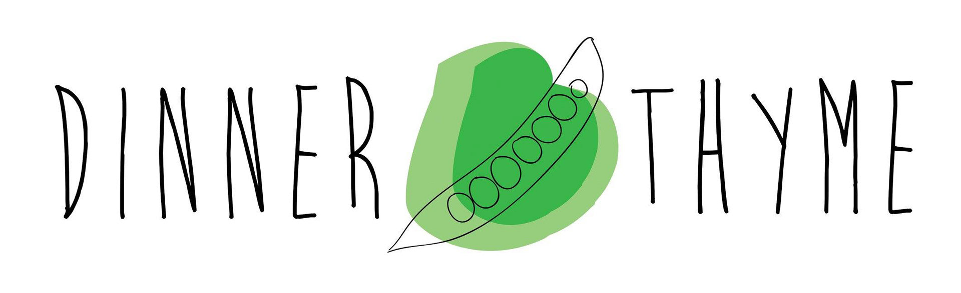
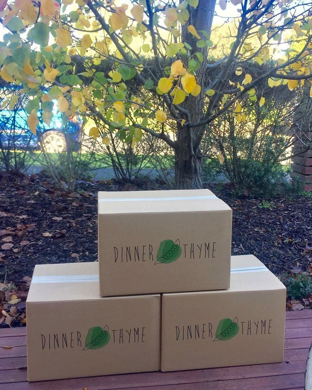
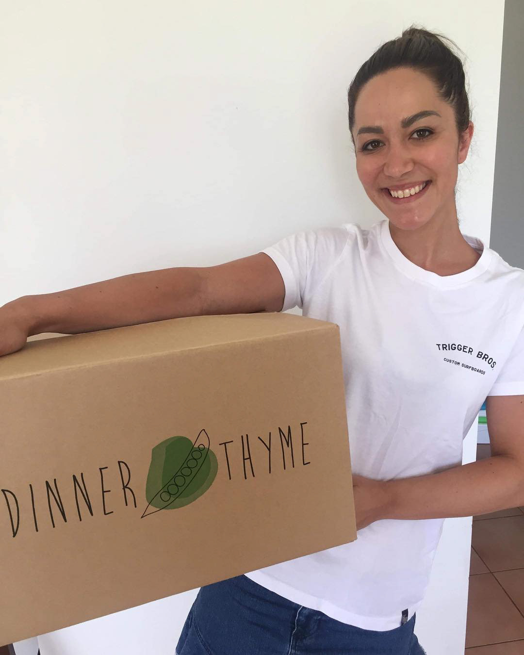
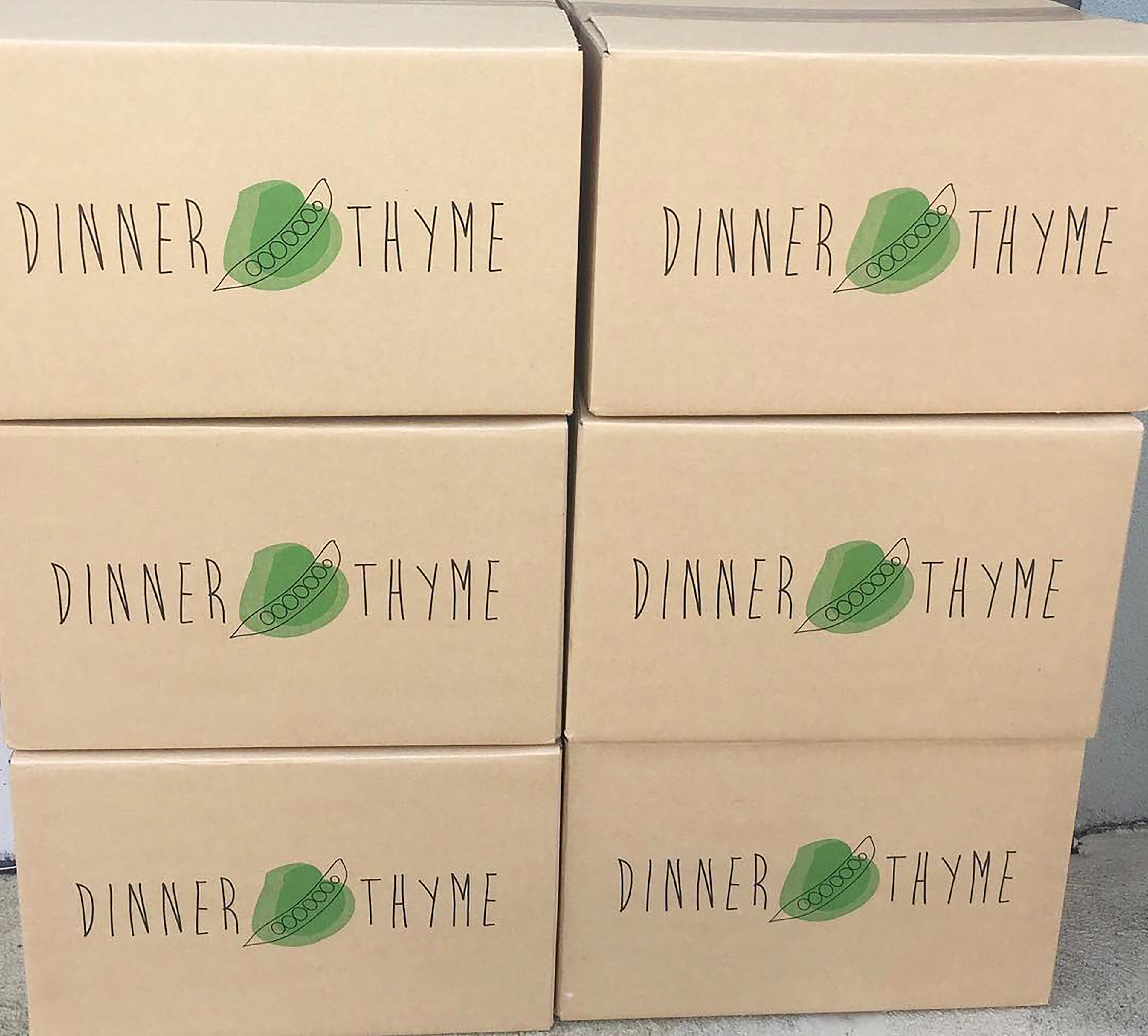
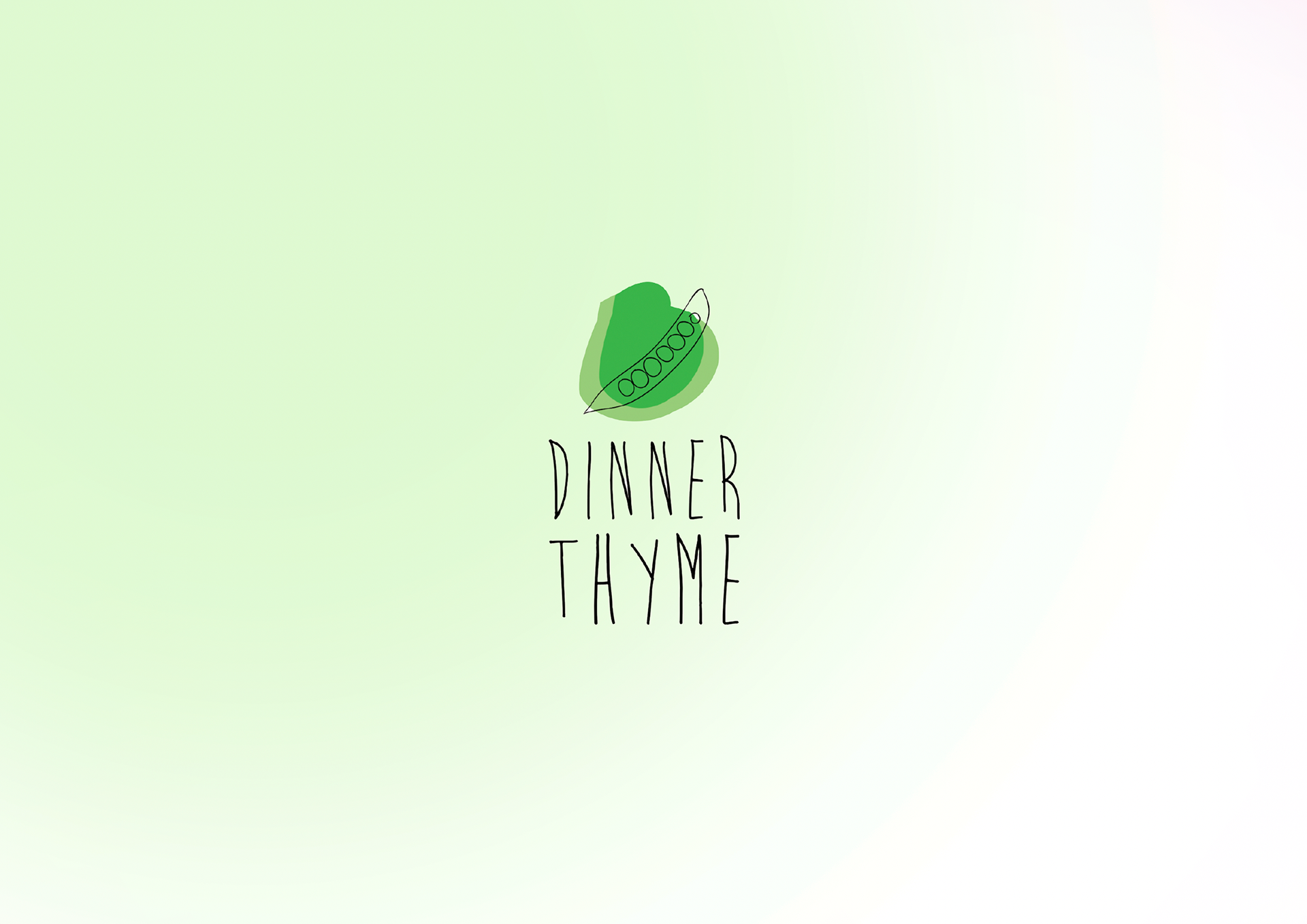
Designing a friendly, raw, and simple logo for a catering company required a balance of warmth, authenticity, and approachability.
The logo features organic, hand-drawn elements or slightly imperfect typography to create a sense of homemade quality and personal touch.
A minimalistic design with clean, flowing lines can keep it simple while still feeling inviting.
Earthy tones like warm browns, soft greens, or muted oranges can evoke freshness and natural ingredients, while subtle iconography—such as a hand-drawn plate, spoon, or sprig of herbs—can reinforce the culinary theme.
The goal was to create a logo that feels welcoming and unpretentious, reflecting the company’s commitment to wholesome, high-quality food while maintaining a raw, down-to-earth aesthetic