CLIENT: Pet Apply (2019)
SCOPE: Identity, Campaign, Strategy, Logo
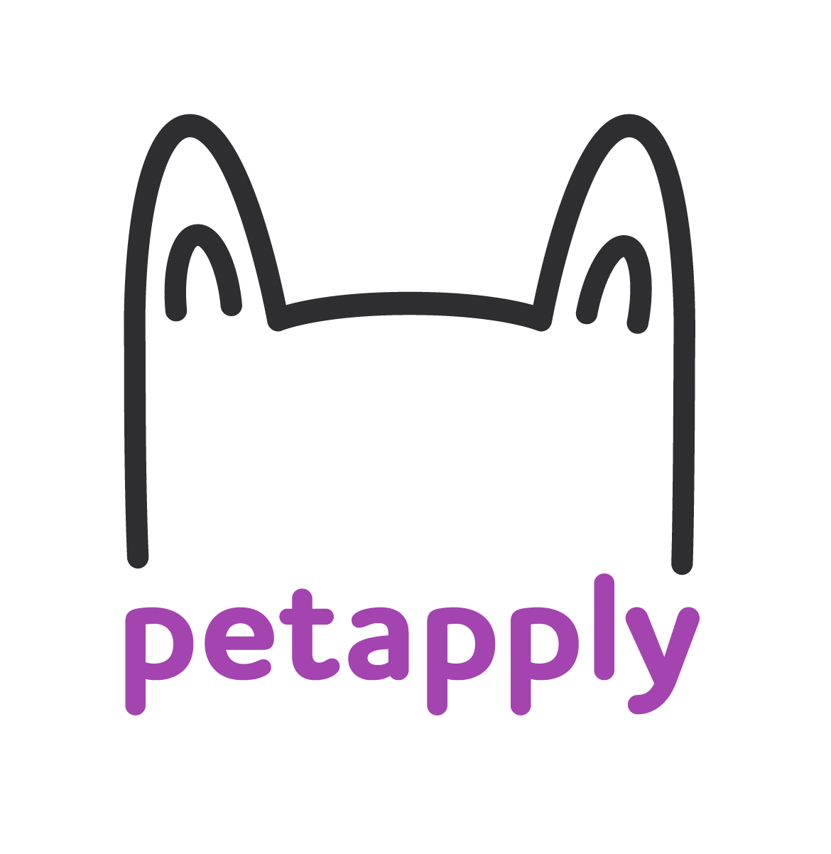
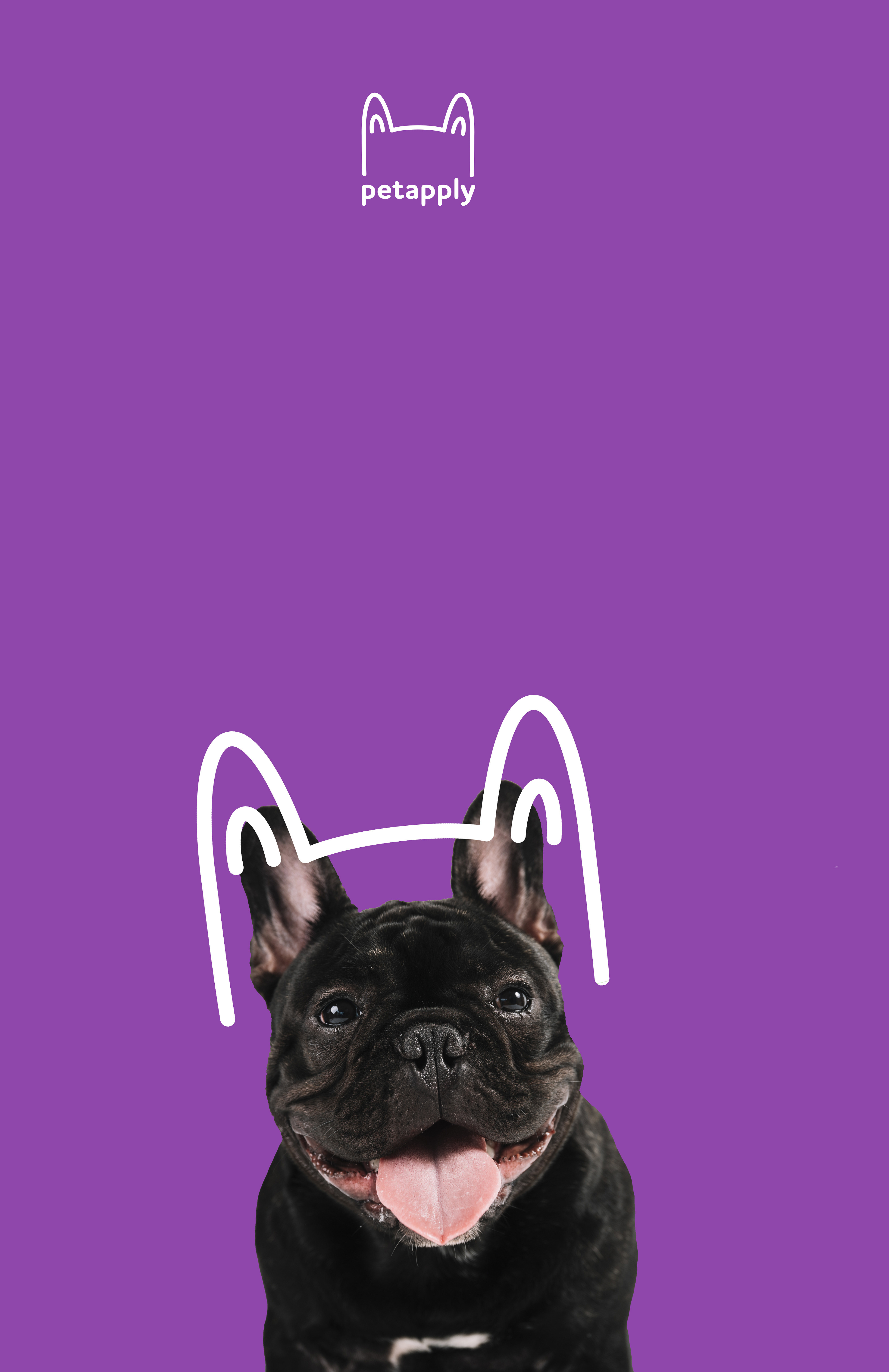
A logo for a pet insurance company that is both friendly and fun involves using playful design elements that immediately convey warmth and trustworthiness.
The logo features soft, rounded shapes to give a sense of approachability, with a colour palette of bright, inviting tones like soft blues, greens, and warm oranges to evoke a sense of safety and happiness.
Incorporating a subtle pet-related symbol, like a paw print, a playful dog, or a friendly cat, can instantly communicate the nature of the business while keeping the tone lighthearted.
The typography is rounded and easy to read, perhaps with a whimsical twist to add personality without sacrificing professionalism.
The overall design balances the fun, carefree aspect of pets with the trust and security that come with insurance, creating a logo that feels both reassuring and engaging for pet owners.